Friday, 15 November 2013

ABC Warriors: The Solo Missions


I pretty much begged for the chance to do this cover. Well, I didn't, but I would have. I fucking love the ABC Warriors. When I was about 12 and it appeared in 2000 AD, Khronicles of Khaos was pretty much the most brain meltingly amazing thing I'd ever read - It was funny, weird, really violent and looked amazing. Plus it was crammed full of bad-ass robots and strange aliens, and the only humans in it were these vile grotesques. Amazing stuff, and quite formative for me really, both as an artist and in terms of things I like to read.
Anyway, above is the full, finished artwork for The Solo Missions, a collection of ABC Warriors one-off stories from annuals/specials etc, plus the Deadlock solo story from 2000 AD a few years ago.
The processes I used to do it were, as usual for me, far too complicated and laborious but I thoroughly enjoy making things hard for myself and its all worth it when it turns out well - like this one did, hopefully.


After drawing some bloody awful group shots in photoshop - trying to somehow get the 'Solo Missions' theme across but showing all 7 characters at once -  I came up with the layout above, which is kinda cool, and also shamelessly plays to my strengths (vehicles/techy stuff/big skies/space). I did it quite straight on the page to start with but realised pretty quickly it would look more dynamic at an angle, and I could make the bike bigger in the frame without losing any of the dead space for text.


Next I jumped into Adobe Illustrator for the background. I could have done this in photohop, but I like the sharpness and endless editability you can get with the vector shapes, and I've really enjoyed making big layered landscapes in this way recently on some other covers like Different Kingdom. I also made myself a perspective grid and some basic forms for the bike, which I printed out onto some drawing paper to use as a guide when doing the pencils for the foreground.


I scanned the pencils back in and inked them in photoshop, then slowly built up the colour and  background objects I'd made in illustrator together into one massive file. For reasons best known to myself I did it at actual size, but 600dpi, which meant the file at the end (which had a LOT of layers) was almost a Gb in size. This got a bit risky towards the end as my mac was really starting to grind... I had a few moments where I thought it had just given up.
Finally I flattened the art, imported it into Indesign and added the cover text. Here's the final cover as it'll appear on the shelves:


Abc Warriors: The Solo Missions is on sale in February from 2000 AD.

Wednesday, 30 October 2013

The Way To Babylon


This is the second cover I've done for the Different Kingdoms series by Paul Kearney, kind of time/space slip novels about people swapping between real and fantasy worlds. The layout is identical to the first book, which made it far easier to get on with as all the design work and style is set in stone, and I can just start making the art. However, I'm also still very pleased with how the cover for book one turned out, so it was slightly intimidating knowing I had to match the quality of that, which is a bit of a high point for me I think. Overall I reckon I did a good job - i don't think the main image is quite as atmospheric as before, but the colours and texturing are much better, and the two books sit together pretty well.


As before I started the cover in Indesign, laying out the text on a file that i'll eventually use to make the pdf files for print, so I can work around the words when I draw image in the centre and nothing overlaps awkwardly. I then copy/paste these basic shapes in Illustrator to draw the pictures, building up layers of increasingly dark detail to give it depth. This time round there's a strange symmetry between the 2 sides, which wasn't initially intentional - things like the wall in the foreground on both halves, and the broken cart vs the old wheelchair. Plus the general contrasting style of the 2 large buildings. I might carry this on to book 3 if possible, to add another level of detail into the art.


Next I paste these black and white vectors into photoshop and go to town with the textures to add some colour and life, also using the same indesign shapes from earlier as layer masks to show the edges of the circles and the split between the worlds, which gets lost a bit when doing the illustrator work. I also add in some leaves and rougher detail which is much easier in photoshop than illustrator. Next up: book 3!


The Different Kingdom books will be released sometime next year by Solaris. 

Friday, 30 August 2013

Blood Kin


Another bit of cover art finished. Doing loads at the moment to get ahead for my impending Paternity Leave. This is for Blood Kin by Steve Tem. He was really keen for it to be a proper bit of overgrown, rotting, slightly psychedelic southern gothic. Below is the cover art without cropping/text design, which for once I didn't try and incorporate from the start.


As this cover has quite a lot of similar elements to Different Kingdom (trees/old houses/leaves) I was keen to make it as different as possible stylistically, so I inked most of the silhouettes by hand then put them all together afterwards in photoshop. For the Kudzu leaves in the foreground I made a some custom brushes in photoshop and built up layers of ever brighter/bigger leaves. Really helped to add some depth to what was quite a flat silhouetted picture. The skull in the bottom right was a last minute addition too. I loved doing this - the whole process/technique I used is something I'm keen to try again!


Scans of the ink drawings and my first mockup from a few months ago.

Wednesday, 21 August 2013

A Different Kingdom


A Different Kingdom is the first book in a series of three by Paul Kearney, originally published by Gollancz in the early 90s. They're all stand alone stories, but are linked thematically rather than by any particular plot, and generally involve people slipping between normal and fantasy worlds and vice-versa. Anyway Solaris are re-issuing them soon, and this is the cover I did them.


All the cover elements were created in Adobe Illustrator, before being pasted, one layer at a time, into Photoshop for colour and texturing. The text and general layout was all done in InDesign, all of which had to be pasted into photoshop too, to use as layer masks when hiding/fading parts of the artwork.


The hardest part for me here was deciding how to create the contrast between both the real and fantasy halves of the picture and the main book background without ending up with some part of the image in negative. My first idea was literally just a spot with two silhouettes in, which I'm glad I managed to ditch, although it took me a while to work out how... 


I like the final thing so much I'm selling a square, untextenated (its a word!) version of the cover art as print from my webshop. If you'd like to buy one click here!


Wednesday, 24 July 2013

Chalk


New cover I finished yesterday for Chalk by Pat Cadigan. Being released as a chapbook by This Is Horror soon!

Thursday, 30 May 2013

Cover Design - Update

PLASTIC
by Christopher Fowler


Up until 3 days after the print deadline this cover didn't exist. I'd mocked up loads and loads of cover designs for this book over a period of weeks, and none of them were ever quite right, before finally settling on a photofit style thing (below). 
Anyway, whilst hurriedly designing the books' interior (having already blown the deadline) it suddenly dawned on me that a simple black and white scalpel/text layout I'd put together for the title page looked far more striking than the proper cover image, so I completely redesigned the whole thing that afternoon!


Some of the many roughs, sketches and mockups I did:


In the end I reused a few of these discarded ideas on the full cover design.

Wednesday, 29 May 2013

Cover Design

THE FICTIONAL MAN
by Al Ewing


First off: this is a fabulous book, go and read it. I hope I've done it justice with this cover, because it really is one of the best things Solaris have published. In the book, characters from novels can be programmed into clone bodies to act in TV shows and Hollywood movies, so for the cover I decided to make a face from words and sentences, and Al sent me passage of text from the story to use for this purpose. I like the weird way the sentences form new ones as they run alongside each other. My workmates were particularly amused by the 'I Hate Drawing' that appears above the right eyebrow (complete accident, and untrue). This has also got to be the first piece of art I've done that required proof-reading...


For once my rough looked quite close to the final version...


Aside from the colours, the back cover and spine layout for the US version are very similar to the UK one, but the American sales team/buyers weren't taken with the crop (or much else) on the original mockup. Initially I just extended the drawing out further than I intended and added Al's name into the face, but i felt in lost some of the impact from the UK one, so decided to just do a more traditional book title design, using the art as a design element rather than the whole cover. Below are some of the many colour options I came up with to try and placate them to start with. I like the repetition in this - it makes it looks quite surreal...


For more information on The Fictional Man click here
To buy a copy go here (Amazon)

DRAG HUNT
by Pat Kelleher


Not much to say about this one as it was really quick to do. It's an ebook only novella, bizarrely about the native american trickster god Coyote and the hunt for his missing penis, which usually resides in a bag around his neck (yep!). After knocking a few ideas around I came up with this ridiculously phallic totem pole made up of imagery from the story, hoping Pat would see the funny side of it and not think I was taking the piss out of his book! Happily he thought it was pretty funny too, and suggested a ton of cool stuff to add in.
The roulette wheels on either side got removed in the name of good taste, but I've included them here because, frankly, I'm juvenile. Pointless fact: the Saxon runes at the bottom say PYE.

Buy a copy here (Amazon Kindle edition)

BLOOD AND FEATHERS: REBELLION
by Lou Morgan


This is the second book in the series by Lou and as ever she's ace to work with. Ridiculously enthusiastic, full of ideas for inspiration, but quite happy for me to try whatever I think might look good on the covers. I'm really pleased with this, especially as an evolution and improvment of the design from the first book, so it still matches the style but without me having to tread old ground.


Ink drawings used in the final art.


To find out more about Blood and Feathers click here, and to buy a copy of Rebellion, click here!
As a final link, here's an interview I gave last year about the creation of the cover art for the first Blood and Feathers book on shewolfreads

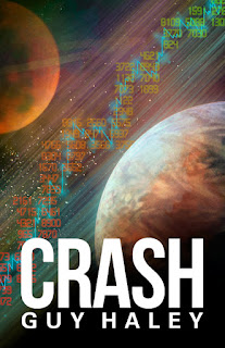
CRASH
by Guy Haley


I love painting space. It was nice to add in some graphics this time too, although the numbers (representing stocks and shares) were a complete nightmare to do - I sat for an hour or so typing about 800 descending random 4 digit sequences, without causing weird repetitions and stuff. Try it (or don't actually), it fries your mind...


The rough layout was a joint idea by Sam Howle and me. This was done waaay in advance for a catalogue, so by the time it came to put the book together I just re-did the whole thing.

Below is this final cover design.


Buy a copy of Crash here.

LIFE ON THE PRESERVATION
by Jack Skillingstead


This is the cover for the UK edition, the US one having been done by the excellent Vincent Chong. So as not to compete with Vinny's I went as graphic as possible for this cover. Below are some of my rough mockups, some of which taking the idea of living inside a preservation dome a bit more literally than others. I'm glad this version was chosen too, the others where probably a bit obvious.


Buy a copy of Life on the Preservation here (Amazon)

Monday, 7 January 2013

Space! Gas! Planets! or: Solaris Rising volume 2


My first bit of art for 2013! Cover for the second Solaris Rising anthology edited by Ian Whates. These covers can be quite text-heavy so I laid the words and planets out together in Indesign/Illustrator before starting in Photoshop to make sure I left enough room for everything, a technique I first tried last year on the Solaris Rising 1.5 ebook. Works quite well this way, as the text really sits in and around the art. Here's the final cover, fully extextinated (yeah, it's a word):


The volume 1.5 ebook cover. Really happy with the fuzzyness of this:


I keep thinking one day I'm gonna stick a spaceship on one of these covers. Here's a couple of roughs I tried, one slightly more in earnest than the other...


I started both images as vectors/fonts in Illustrator and Indesign to get the layouts right, before pasting all the basic shapes as separate layers into Photoshop for colour and texturing. Here's roughly the how the files started off: