
THE FICTIONAL MAN
by Al Ewing

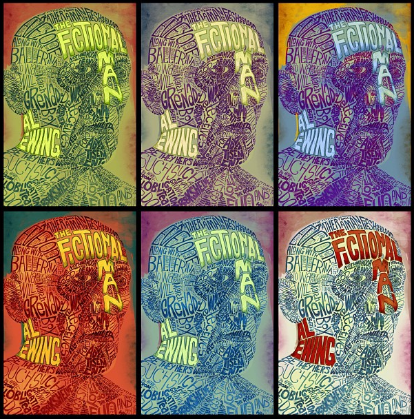
First off: this is a fabulous book, go and read it. I hope I've done it justice with this cover, because it really is one of the best things Solaris have published. In the book, characters from novels can be programmed into clone bodies to act in TV shows and Hollywood movies, so for the cover I decided to make a face from words and sentences, and Al sent me passage of text from the story to use for this purpose. I like the weird way the sentences form new ones as they run alongside each other. My workmates were particularly amused by the 'I Hate Drawing' that appears above the right eyebrow (complete accident, and untrue). This has also got to be the first piece of art I've done that required proof-reading...


For once my rough looked quite close to the final version...

Aside from the colours, the back cover and spine layout for the US version are very similar to the UK one, but the American sales team/buyers weren't taken with the crop (or much else) on the original mockup. Initially I just extended the drawing out further than I intended and added Al's name into the face, but i felt in lost some of the impact from the UK one, so decided to just do a more traditional book title design, using the art as a design element rather than the whole cover. Below are some of the many colour options I came up with to try and placate them to start with. I like the repetition in this - it makes it looks quite surreal...
DRAG HUNT
by Pat Kelleher

BLOOD AND FEATHERS: REBELLION

Not much to say about this one as it was really quick to do. It's an ebook only novella, bizarrely about the native american trickster god Coyote and the hunt for his missing penis, which usually resides in a bag around his neck (yep!). After knocking a few ideas around I came up with this ridiculously phallic totem pole made up of imagery from the story, hoping Pat would see the funny side of it and not think I was taking the piss out of his book! Happily he thought it was pretty funny too, and suggested a ton of cool stuff to add in.
The roulette wheels on either side got removed in the name of good taste, but I've included them here because, frankly, I'm juvenile. Pointless fact: the Saxon runes at the bottom say PYE.
The roulette wheels on either side got removed in the name of good taste, but I've included them here because, frankly, I'm juvenile. Pointless fact: the Saxon runes at the bottom say PYE.
Buy a copy here (Amazon Kindle edition)
BLOOD AND FEATHERS: REBELLION
by Lou Morgan


Ink drawings used in the final art.


This is the second book in the series by Lou and as ever she's ace to work with. Ridiculously enthusiastic, full of ideas for inspiration, but quite happy for me to try whatever I think might look good on the covers. I'm really pleased with this, especially as an evolution and improvment of the design from the first book, so it still matches the style but without me having to tread old ground.

Ink drawings used in the final art.

As a final link, here's an interview I gave last year about the creation of the cover art for the first Blood and Feathers book on shewolfreads
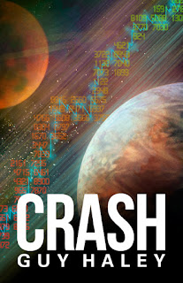
CRASH
by Guy Haley


Buy a copy of Crash here.
LIFE ON THE PRESERVATION


Buy a copy of Life on the Preservation here (Amazon)

I love painting space. It was nice to add in some graphics this time too, although the numbers (representing stocks and shares) were a complete nightmare to do - I sat for an hour or so typing about 800 descending random 4 digit sequences, without causing weird repetitions and stuff. Try it (or don't actually), it fries your mind...

The rough layout was a joint idea by Sam Howle and me. This was done waaay in advance for a catalogue, so by the time it came to put the book together I just re-did the whole thing.
Below is this final cover design.

Buy a copy of Crash here.
LIFE ON THE PRESERVATION
by Jack Skillingstead

This is the cover for the UK edition, the US one having been done by the excellent Vincent Chong. So as not to compete with Vinny's I went as graphic as possible for this cover. Below are some of my rough mockups, some of which taking the idea of living inside a preservation dome a bit more literally than others. I'm glad this version was chosen too, the others where probably a bit obvious.

Buy a copy of Life on the Preservation here (Amazon)


