Showing posts with label InDesign. Show all posts

Wednesday, 30 October 2013

The Way To Babylon


This is the second cover I've done for the Different Kingdoms series by Paul Kearney, kind of time/space slip novels about people swapping between real and fantasy worlds. The layout is identical to the first book, which made it far easier to get on with as all the design work and style is set in stone, and I can just start making the art. However, I'm also still very pleased with how the cover for book one turned out, so it was slightly intimidating knowing I had to match the quality of that, which is a bit of a high point for me I think. Overall I reckon I did a good job - i don't think the main image is quite as atmospheric as before, but the colours and texturing are much better, and the two books sit together pretty well.


As before I started the cover in Indesign, laying out the text on a file that i'll eventually use to make the pdf files for print, so I can work around the words when I draw image in the centre and nothing overlaps awkwardly. I then copy/paste these basic shapes in Illustrator to draw the pictures, building up layers of increasingly dark detail to give it depth. This time round there's a strange symmetry between the 2 sides, which wasn't initially intentional - things like the wall in the foreground on both halves, and the broken cart vs the old wheelchair. Plus the general contrasting style of the 2 large buildings. I might carry this on to book 3 if possible, to add another level of detail into the art.


Next I paste these black and white vectors into photoshop and go to town with the textures to add some colour and life, also using the same indesign shapes from earlier as layer masks to show the edges of the circles and the split between the worlds, which gets lost a bit when doing the illustrator work. I also add in some leaves and rougher detail which is much easier in photoshop than illustrator. Next up: book 3!


The Different Kingdom books will be released sometime next year by Solaris. 

Friday, 12 October 2012

Ravenstone


Ravenstone is a new Children's and Young Adult publishing imprint set up by Rebellion. For the last few weeks I've been doing all the branding and stuff for them in anticipation of the launch, starting off with a basic logo design, but applying that style to all the promotional items, sales sheets and website etc. There's still a lot to do, as they haven't actually published a book yet, but here is some of the stuff I've done so far.
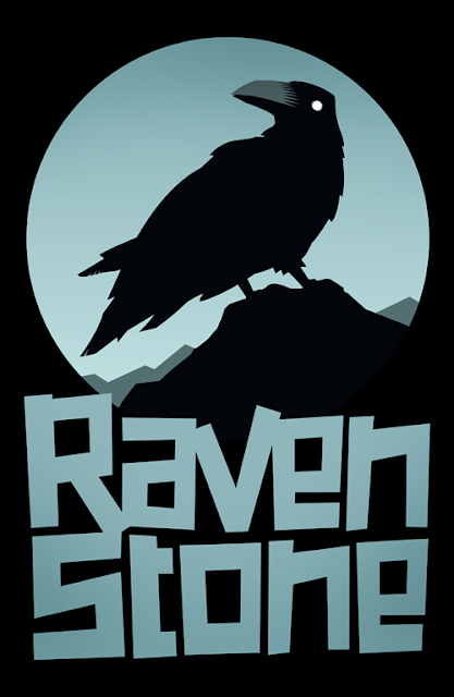
First up, and most important, was the logo. I offered up quite a few options when designing it, just sketching loosely in photoshop:


Luckily, everyone was pretty much agreed on the best ones on this list (the sketches around the 30s), so we whittled this list down to about 3 options and I went from there.


I ended up taking the type idea from the bottom right one, and adapting the top 3 into one idea (1d). The only thing I really didn't plan for in the sketches was flipping the raven so he comes towards you rather than facing away. Once I'd started working in illustrator he just didn't look right with his back towards you, and by having his head facing forwards I could make the eye and beak bigger and more prominent, which gives him a bit more character.
Here are some alternative colour options. I'm hoping to expand on these, adapting the colours to match whatever art the logo has to sit on.


Below is the banner I came up with for the main Ravenstone website. I took the basic logo and changed it into a full illlustration, drawn using a combination of vectors from InDesign and Illustrator, then adding some texture and shadows etc in Photoshop. I'm quite keen to go back to this and either animate (the windmill could move, the grass and tree could wave in the wind, the bird could fly in and land! quite excited by the options here) or add detail to it as time goes on. This is a kid's book line after all, and I'd really like the website to be as visually interesting as possible.


Next job is to make the Ravenstone typography into a full, workable font which I'm in the process of doing now. Been teaching myself to use Fontographer, so it'll be one of my first jobs with that. So far I've only worked out the lower case letters.


To find out more about Ravenstone (and to see all the branding in situ) please check out their
website    //    blog    //    twitter