Wednesday, 12 November 2014

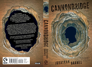
Cannonbridge


I had two days to come up with and finish this (it went to print today and I only started it on Monday morning), which was a bit hairy... Actually that's a lie, I've known I had to do it for weeks, but it just kept getting pushed down the list til it was AAARGHURGENT! Nothing focuses the mind like a looming deadline, and your boss asking "you done that yet?" every day for a week...

Here's the blurb:
Flamboyant Matthew Cannonbridge was touched by genius, the most influential mind of the 19th century, a novelist, playwright, the poet of his generation. The only problem is, he should never have existed, and recently divorced 21st century don Toby Judd is the only person to realise something is wrong with history.

Quite a cool idea. Unfortuntely I kept getting stuck on images and ideas that were too similar to my Fictional Man cover (i.e. people made from words), and had trouble thinking of anything new. 
I thought about making an origami man from book pages and either taking some photos, or faking one in photoshop, but I ditched that as the only origami patterns available were either rock hard or complete shit.
With no time left I settled on a kind of wormhole through some old looking manuscript pages, with a victorian cameo silhouette of Cannonbridge revealed at the bottom. Here's the rough.

To try and stop it looking too faked, I spent about 2 hours printing out a yellow texture onto A3 bits of paper, then tore gradually smaller and smaller holes into each, scrunched them up into balls, squashed them flat again, scanned them in one at a time and assembled them in photoshop. The resulting papery mess is still on my desk - it looks kind of cool!

About halfway through I realised it would look much better if Cannonbridge's face appeared naturally in the negative space left by the torn holes, rather than just plonked as silhouette at the bottom. It meant a bit more work, but was a million times cooler than the incongruous silhouette I had on the rough. Glad I thought of it too, as it's the kind of thing you'd come up with afterwards and kick yourself for not doing.
Lastly I typeset some passages of text from the story and pasted it randomly over the blank page scans, then spent quite a long time mucking with the shadows and colours to get it looking convincingly deep. The final cover design is below.


I'm not sure what I think about it yet. Normally I get a bit more time to indulge in a bit bit of navel gazing, but cos of the time constraints I just had to get it done. On one hand thats quite freeing as you just have to go with your instincts and trust it'll turn out ok, but looking back at the rough now I wonder I the final version has lost a bit of the punch that the first one had... I like the red in it, and the kind of energy to the hole... ABORT! ABORT! move on... it's too late now!
Laters!
pye

Tuesday, 28 October 2014

The Awesome Cover Art


Not often you get to write that as a header without feeling like a total tosspot... Anyway, this is the cover for The Awesome by Eva Darrows, a YA novel from Ravenstone about a kick arse teenage vampire hunter from a family of kick arse vampire hunters, who all of a sudden has to try and fit in with normal society, find a boyfriend and lose her virginity before she starts sending the vamps crazy (which is what happens apparently). The brief was pretty open so I tried to do something that was the exact opposite of the tedious 'hunks/babes in a blue graveyard' Buffy/Twilight inspired stuff you get on Urban Fantasy books a lot of the time. Plus, if I could get away with using evil looking dayglo green skulls and neon pink text I'd be well happy.


rough mockups
full cover design

Above are my first sketches. The diagonal split on the second (used) rough was a complete accident. Whilst fiddling with the photoshop layers from my first attempt it just happened that one of the textures I'd used split the page in half - It looked pretty cool, so I worked around it. Normally I do more mockups than this, but was so taken with it I sent them straight to Editorial/Hillary.
After the initial suprise of getting a luminous green punk vomit cover (having expected something quite different) it seemed to go down pretty well - the only addition requested being the crossed stakes pattern over the bottom half to ramp up the vampire/love element, which I think was a good call.


The skull was drawn straight into Photoshop (we have a cool plastic skull model in the Rebellion office that I used as reference) with the white, black and grey on separate layers. Once I was happy with the form I pasted it over the rough (which I did a full size) and started to muck with the colours. I've been keen to try this for a while (previously when drawing in this style I kept the lines black), as one of the problems I found with high contrast black and white art is that it's really tough to get any text on top to stand out. Beyond that it was pretty simple; The title text needed some work to make it more readable, and I drew the heart patterns in illustrator to make them more uniform, but all the colours and stuff were sampled straight from the rough layout. 


The book wont be out til next year, but I put together an advance review copy earlier this week - these are some designs for the internal spreads.

Tuesday, 22 July 2014

Fear of the Dark


Nyctophobia is fear of the dark, which is a hard concept to get across on a book cover, especially without resorting to monsters and ghosts and stuff (which I did to start with!), so I did a LOT of roughs and not-so-roughs for this cover - none of which were used in the end, as the final covers had nothing in common with them really! The idea for the UK cover (above) came out of a day dream I had at my desk after banging my head against a wall for half an hour having run out of ideas. It's based on some photos I took of a lightbulb was almost finished as soon as I'd mocked it up. The US version (below) was kind of an accident - I was mucking around with some textures for something else and they looked kind of noirish and spooky, so I added a house and a moon and it was pretty much done.


I still really like some of the rough ideas I had to start with, so I might try and reuse parts of them in something else in the future. They were deemed (correctly!) to be too graphic-novely for the tone of the book, or just a bit too supernatural/action based. I got quite far in the rendering of a few of my favourite ones too, so its a shame to just forget about them. Anyway here's the very first lot I did. Originally in the story the house were the action takes place revolved to face the sun, so one side was light all the time, and the other dark. That idea got dropped though, so immediately some of these weren't quite right. An unfortunate side effect of doing covers for books that aren't yet finished.


The below was the cover version I liked best, but I couldn't make it work quite right - the figure was too small, or squashed up, and the shadows cast by the lamp that form the letters didn't work in the way I wanted them to. This led into the version at the bottom, which used the same idea, but makes it a bit less flat. This was definitely too much like a comic though, although I like it in its own right. I might finish it off at some point just for the sake of it.


The final book goes to print this week. On the opening spreads of the internals I gave over a few pages for the lightbulb slowly tuning on, page by page - almost like a flick-book, which seemed like a cool thing to have instead of a bog-standard title page. It gave me the idea of actually trying to animate it properly though, and this is the result (be kind, it my first ever attempt at this kind of thing!).


Nyctophobia is on sale 9th October 2014.

Wednesday, 23 April 2014

The Raven's Banquet


More cover art, using the same style as the Lupus Rex cover I did a few weeks ago for reason other than I thought it looked cool and wanted to try it again! The sky is a darker colour than I wanted originally cos I screwed up and couldnt get the coverlines to standout properly (again)!
Final cover design, black and white linework and roughs below. The Green man face is a little pic for the chapter break pages on the internals, which was shamelessly ripped off from some photo ref supplied to me by the author, so I can't claim much credit for that. Pleased with the Raven though!


EDIT: just found out this book is getting a super-limited paperback release (it was ebook only up until this morning!), which is awesome! I've had to put together a full cover design today -  Here it is:


Monday, 24 March 2014

King of the Wolves!


This cover is for a second edition printing of Lupus Rex by John Carter Cash, published by Ravenstone. The first edition hardback had a cover by Douglas Smith (which was lovely - I did the design work for it, and was really proud of how it turned out). When we came to do a paperback reprint for the UK I got the chance to do something myself. The US paperback got a new cover too - by Edouard Groult one of Rebellion's concept artists - but both that and Douglas's original were quite similar in tone if not style, so I went in as different a direction as I could think of.


I did the main illustration quite quickly, all freehand in photoshop, but using the lasso tool to both add and remove texture from the wolfs fur. It worked quite well so I'm hoping to use he technique again in the future. The cover text was slightly more problematic. Because the picture was high contrast and in simple colours, it was very difficult to make the text stand out in any colour other than white, which annoyed me slightly as I'd tried very hard to not use white anywhere in the image - and its doesn't appear anywhere else on the front or back cover design. This is something that's likely to bother me more than anyone else though, so after several hours of mucking around I left it as it is above.
Below are the roughs I came up with to start with (I knew early on I wanted to do something almost designey - using silhouettes, just had to decide what, and how), and the full cover layout.


Putting the flying quail in the spine logo was one of the last things I did - and possibly my favourite thing on the cover now, if I'd have thought of it earlier, it could have gone in a totally different direction.

Wednesday, 26 February 2014

Car Paintings


Ford GT40
20x30" Oil on canvas board.

Awesome looking Ford GT40 I saw race in the 50th anniversary cup at Goodwood Revival last year. Got my mate Kev to take some photos of the final painting this week cos it's off to a gallery soon and maybe I'll never see it again.
A few work in progress pictures below. I did this in 4 sessions of about 2 hours each. Was quite tempted to stop working on it at every stage after the 2nd. Had a nice solidity to it throughout and I was scared to lose the energy by tightening it up too much.

This painting is for sale - get in touch if you're interested!


1935 Lagonda Rapier Special 
32x24" Oil on canvas board


Another car I saw racing, this time at Shelsley Walsh a few years ago. Looked awesome so I went and took some pictures of it in the pits. I finished this directly before the GT40 above. Bit of a breakthrough for me cos it's got a lot more movement than my previous paintings, which is something I;d like to carry on.
There's a few in-progress photos below. Not so many this time - I think I fell out with this picture for a while in the middle section so didn't document what I was doing! I read something once that said (to badly paraphrase) every painting has to go through a stage where it looks vile, somewhere between the promise of the rough sketch and the final art where its neither one thing or another. Certainly seems true in my experience.

This painting is also for sale. Again, let me know if you're interested.


To see some of my older paintings check out Kev's flickr set here

Friday, 24 January 2014

Dead Stop


First cover of the year finished. Hopefully the first of many!


The logo part was done in Illustrator, i then skewed it and faked the 3d effect, then dropped it onto the background in photoshop and added some lighting and stuff. This is available as an ebook from Abaddon Books.