Showing posts with label 2000 AD. Show all posts

Monday, 17 September 2012

Ratfink

Took the opportunity to right some wrongs the other day when I did the cover art for the Judge Dredd Megazine 328 graphic novel; Ratfink. I did the covers for the first printing of the story in the Meg several years ago, and they were bloody atrocious - so I was glad Tharg let me do something new...


I was gonna go with an unused bit of art I did at the same time as the first lot of covers, just updating it a little bit, so started re-doing the pizen ball, then changed my mind and used it as the basis for the new picture above. Pretty much the only thing that survived was the texture and the border! It was orange like the original painting to start with, but I decided to go with a more muted palette to match Pete Doherty's strip art. His colours are always fabulous, really natural, so it seemed stupid to stick a REALLY REALLY ORANGE bit of art on the front. Hence the blue!
Below are the original unused cover, the orange version of the above, and the final image without coverlines and logos. I dropped the skyline down fairly shortly after altering the colour, cos the sun and rocks and stuff got wiped out by the logos.


On the subject of Ratfink, Pete Doherty has posted some of his sketches for the character on his blog. Check it out HERE

Friday, 29 June 2012

They Are Coming... The Dark Judge Teaser Campaign


This is the 2000 AD promotional campaign that ran for 4 weeks on CBR, for the return of The Dark Judges, Fear, Fire and Mortis in the Judge Dredd story Day of Chaos. Each week one set of posters was released, hinting at the contents of the story to come.

WEEK 1


Although these are the simplest of the 4 waves of artwork, they almost took the most time to do. Apart from setting the style for the rest of the campaign I also had to come up with a way to represent each of the 3 characters as a minimal but relevant symbol. Myself, Mike Molcher, the PR bot and Luke, the other 2000 AD designer, knocked around loads of ideas before settling on the 3 symbols shown here.


Judge Mortis was by far the hardest to come up with. How do you describe decay or entropy in a few stylised lines? I don't think I've not seen a single person guess what that symbol means yet unfortunately... it's a pile of smoking ash. Almost the hideous aftermath of Mortis' touch. I got the idea from watching Dr. Brian Cox explaining entropy on TV using a pile of sand, which I remember being pretty cool. The other two are slightly more obvious - an eye for Fear (he has loads them inside his helmet in one story, and there's plenty of wide-eyed victims in Brian Bolland's art) and flames (duh?) for Fire. I was worried, knowing their meanings, that everyone would guess them straight away. Luckily only one guy guessed correctly - and nobody seemed to notice!


Below are the initial ideas I came up with in InDesign for various stages of the campaign before it started. Almost everything on here was changed on the final versions. Notice I started off doing a matching poster for Judge Death as well (just for completeness sake, and my own bloody-mindedness) but soon had to stop as the art got more complex and deadlines loomed!


WEEK 2


In the second week I decided to focus on the Dark Judges weapons, or powers, but linked the art to the first wave of images by making the original symbols into a background for the new ones.


These are probably my favourite posters of the lot, as they're still quite graphic, but with enough texture and detail to have a bit of depth. I also started going to town in photoshop, adding more texture than previously.


WEEK 3


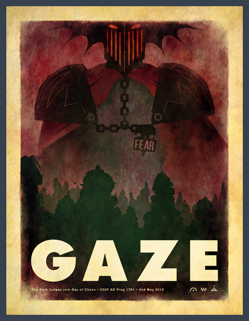
The third week was all about face shots. We pretty much expected everyone with 1/2 a brain to have got the hint by now, so we changed the text a bit. Si Spurrier came up with the idea of using GAZE, BURN and DECAY instead of the Judge's name running along the bottom, which fitted with the theme we'd set really nicely. Just glad we didn't have to come up with a Judge Death version for that. What would we have written? CRIME? LIFE? I dunno. It still annoys me I can't think of a good one (even though it has no bearing at all...)


Had a bit of a false start with these ones. After banging out Fear very quickly and satisfactorily I made a bit of a balls up of Mortis and Fire - both of which where far too illustrative. I had to quickly redo both on deadline day after a hurried chat with Molcher. He was apologetic but absolutely right in thinking they don't match the look of any of the other bits of art, so I changed them. I kind of knew they weren't right, but I'd run out of steam on Friday night and was a bit stuck. Just as I was getting panicky, Luke helped me out by coming up with a much cooler, more stylised version of my original skull picture, which kind of kick-started the mortis one. The original pictures are below.


Week 4


The final pictures for the campaign! Went right to the wire on this one again as they were getting so complex I was having trouble fitting them in around my other work.


Below are the rough mockups I did in Indesign. I don't normally work like this, but as art is so graphic and stylised it was much quicker to mock them up this way before I started the proper art in Illustrator and then Photoshop

These final 3 images are now available as posters on the 2000 AD online store - go buy one!


The last thing we did at the campaign climax was to black out the 2000 AD website for a day when the prog came out, replacing it instead with the image below.


Thursday, 26 January 2012

DEATH PLANET! plus: Avert Disaster Today!


DEATH PLANET! This is a cover I finished today for the graphic novel that gets bagged with the Megazine each month. Next issue it's reprinting DEATH PLANET (it needs to be written in caps) by Alan Hebden and Lopez, and as it never had a cover when originally printed Tharg asked asked me to draw one. His brief was something like 'a planet dripping blood' but I went to town and made it look like an old video nasty instead. I have to admit it doesn't have much to do with the strip itself, but it's a pretty cool image. I came up with the crappy tagline myself, so this will almost certainly get ditched on the print job. Below are a couple of rough I did beforehand.


Ages ago Robo-k33f and I came up up with a fun idea for a subscriptions advert in 2000 AD that would read more like a propaganda poster than a sales pitch, involving whole planets getting leveled and blown up for daring to cancel their weekly Prog.
I think Tharg kind of liked the idea, so I came up with something a bit more concrete one afternoon, complete with ridiculous small-print and condescending tone. Unfortunately actually doing the art and getting it finished proved a little harder to fit in, but after a few months of putting it off it was printed in the Prog 2012 Christmas special. It'll also get tweaked a little bit to run in the special Free Comic Book Day 2000 AD issue in the US.
Below is the art without stuff on, and below that my pencils.


Frogmen vs. Dogmen! This is something I've wanted to draw for ages, for no reason other than it would be violent, and cool. It's a titanic struggle of the ages that my dog seems intent on continuing in my back garden. It's time frogs got their own back.


Although this goes unmentioned in the advert, the purple blob in the background is called 'Thangar Void-Eater' and is named after a weird bloke we saw wandering round a convention one year. At the time we were bored out of our minds, suffering badly from stuck-behind-a table-madness and were passing the time by making up fantasy back-stories for the strange people that were walking around. It's probably worth saying he looked nothing like this in reality.


Pretty much the perfect way I'd like to read 2000 AD each week: in a tatty old armchair with tea and biscuits. And gin. The dog is based on Baz, my insane Paterdale Terrier. Also, I don't know if anyone will notice this but Tharg is peering over the fence in the background. I thought about having him stood behind the Squaxx with his hand on his shoulder in a paternal way, but I thought instead I'd make him leer like a sex-pest from behind a hedge.


Various stages of the SalesBot character. I came up with a great pun for his name, and was gonna write it on his head, but I can't for the life of me remember it, so he stays nameless. For now let's call this pink cretin Molch-R.

In the spirit of the advert: Click here to subscribe to 2000 AD - your species depends on you!

Monday, 31 October 2011

2000 AD/Rebellion Design Stuff

I don't ever really bother putting anything on here about the design work I do at Rebellion, so here's a few of the more interesting things I've done recently. Most of my time day-to-day is taken up with the design and production of 2000 AD, the Megazine, Graphic Novels and the Solaris and Abaddon books, but I always enjoy working on stuff that's a bit different.


First off is the 'manga-sized' Dredd graphic novels we're putting out. 'Manga-sized' actually means 'B' format, which is a pretty standard UK novel size (128x198mm). We did quite a few tests at different sizes to make sure that the speech bubbles where still readable and that the art looks as good as ever, and the B size seems just about right. Personally I would have prefered something slightly squarer so the art fitted larger on the page, but a custom page size would have cost much more to print and defeat the point of the smaller sized books (and would probably have only added 10mm on to the width of the art anyway) so it's a small quibble.
There's quite a few in the pipeline, but I can only show a couple of the covers at the moment. Really excited about them though. Like with the Case Files series it was good to present some classic stories in a new way. We wanted these to looks a bit more book-y than our usual GNs, so as not to immediately alienate people who wouldn't usually want to read a comic on the train or whatever. Hopefully we've done that.
The artwork on both of these editions is by Mick McMahon, definitely one of my favourite Dredd artists. It wasn't a conscious decision to use him on both covers, but his art just fit the space left by the design. I'm hoping to get a decent selection of the other Dredd artists on some of the later volumes.


This is a bit random: A recruitment campaign for Rebellion that's going in Develop Magazine and on their website. Usually jobs like this get banged out in 5 minutes flat as various deadlines are always looming, so it was nice to take a bit more time on one. Considering how much great concept/3D art we have floating round the office it's surprizingly hard to find pictures to use for this kind of thing, as very often any game in production is still top-secret, or licensed from a big company who'd take weeks to approve any artwork - hence these being entirely type-based.


Here are a couple of Judge Dredd 'in-world' logos I did a while ago that haven't been used for anything yet (although watch this space). Tons of stuff I do like this doesn't ever get to see the light of day, so here they are:


Below is a selection of some of the (many) character/story logos I've designed over the years for 2000 AD. The Zombo one is a personal favourite, but I'm happy with the Numbercruncher logo too.

Zombo created by Al Ewing & Henry Flint

Ichabod Azrael created by Rob Williams & Dom Reardon

Numbercruncher created (and owned) by Si Spurrer & PJ Holden


Indigo Prime created by John Smith & Chris Weston

(although this logo gets used on artwork by Edmund Bagwell)


Cursed Earth Koburn created by Gordon Rennie & Carlos Ezquerra

Samizdat Squad created by Arthur Wyatt & Paul Marshall

Lastly are some graphic novel cover designs. The Harlem Heroes book is based on the Team's kit from the story, and the ball and logo are lifted off the interior art. I've no idea who made the original Logo but I think it's great!
The Ichabod Azrael ones are concepts for a US edition to be released in 2012, but it's not yet confirmed and these may not get used. I quite like the block of text though. I did this in the same week as the Rebellion advert above. Can you tell?


I should probably point out that all this stuff is © 2011 Rebellion A/S, apart from Numbercruncher which is © 2011 Simon Spurrier & PJ Holden. It's also aces!